Valórate Psicólos is a psychology clinic in Madrid, specialized in clinical psychology and focused on young people and adolescents.
As it is aimed at young and teenagers, Valorate offers sessions adapted to them to make it easier for them to attend the sessions. Therefore Valorate adapts the price to the personal circumstances of each and offers online video therapy to adapt to the place and time of their patients.
Its objective is to facilitate patients’ therapy assistance and thus help them in their well-being during and after the process.
“When we are not well emotionally we do not get good sleep and therefore, we wake up even worse. Valuing yourself, as her own naming indicates, helps you to value yourself, to accept your emotions and control them through psychological support, and with it, Valuing helps you sleep better and be able to get up every day with enthusiasm and well-being.”
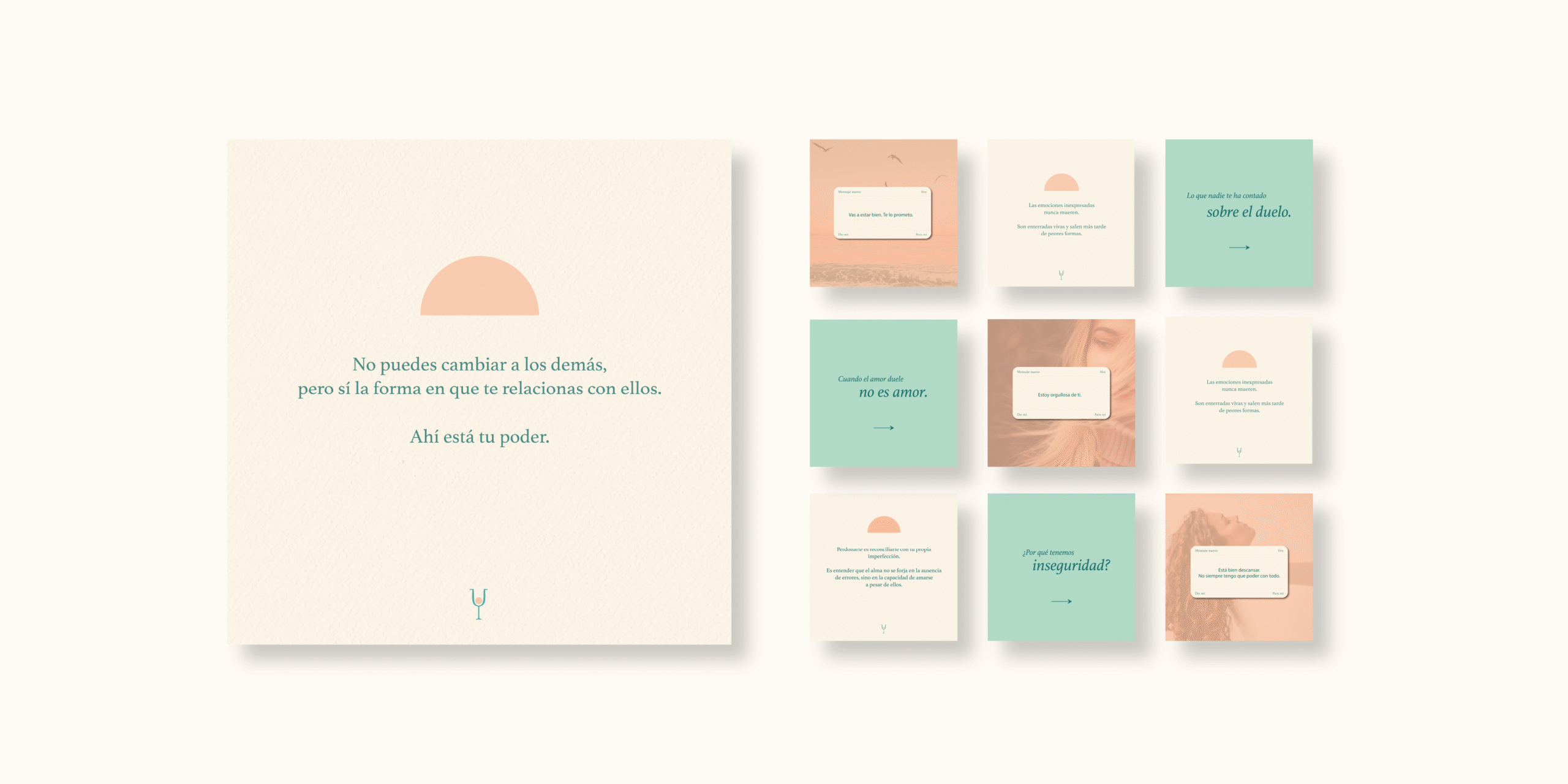
A calm and young color palette
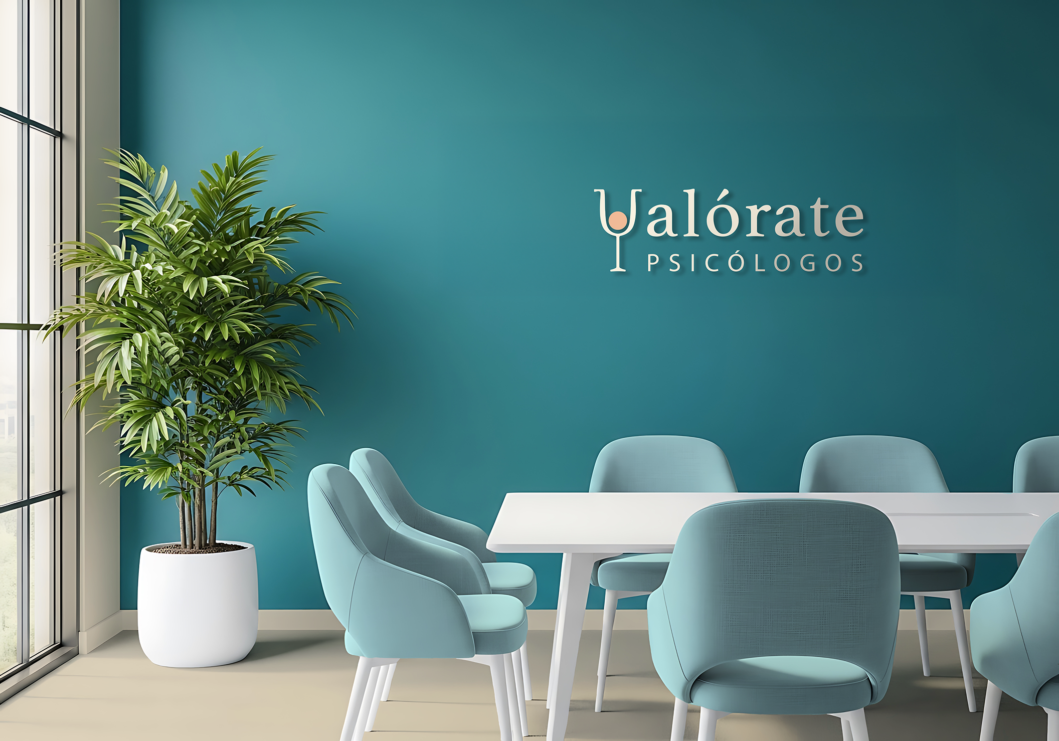
Corporate colors reflect the shades of the dawn, as a representation of the light that appears after the darkness. A new day dawns, a new opportunity appears.
Valórate Psicólogos will help their patients wake up every day more eager than ever, to value the new opportunities offered by waking up every day.
In addition the colors mark a psychological contrast between calmness, security and serenity that transmits the color blue, with the vitality, energy and youth that transmits the color orange. All of them positive fundamental qualities that reflect the personality and values of Valórate.
Typography
Athelas, a roman serif typography but with great contrast as main, appealing the history of psychology and its evolution. Using the tiny letters in the logo to convey closeness and kindness.
Created by Veronika Burian and José Scaglione
As second typography, a sans typeface family, geometric and simple, giving a clean and humanist style.
The sans Geomanist typography contrasts with the Athelas serif typography, thus achieving a balance between the professional and historical aspects of psychology with simplicity and humility.
Created by Atipo Studio.
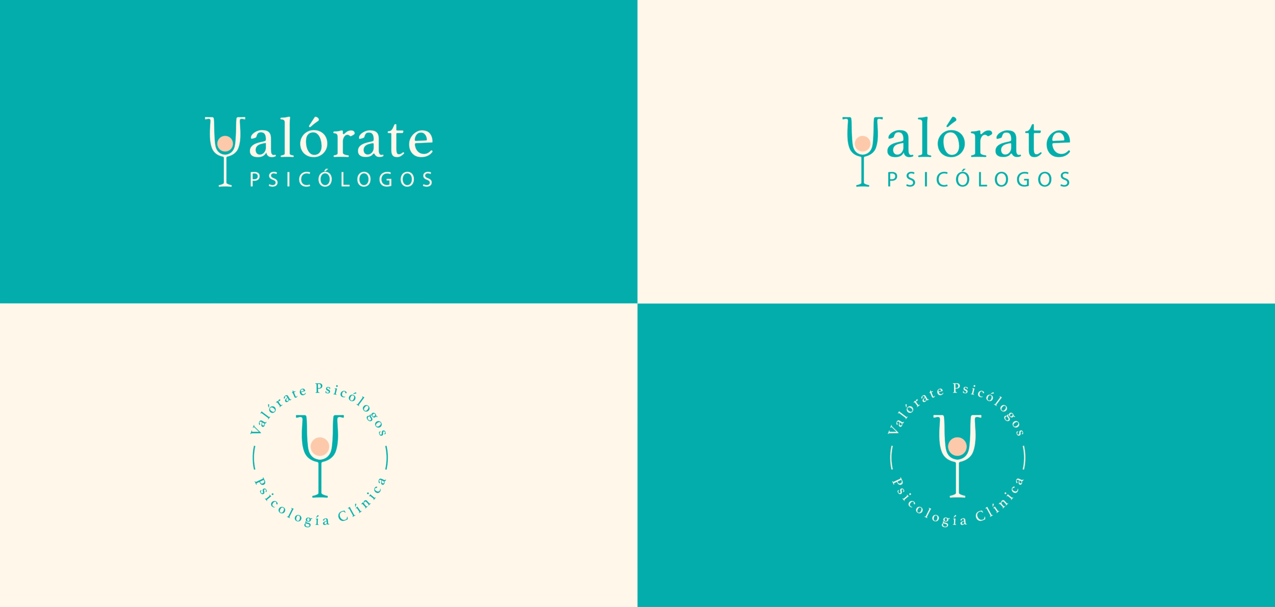
Logo Construction
To develop the logo construction firstly the letter V has been replaced by the icon of psychology adapting to the tracings of the typography Athelas. Then the form has been placed circular (the sun) behind the symbol created representing the dawn.
Except for the replacement of the letter “V”, the lowercase Athletas Bold typeface has been retained, including the slant of the letter “o” to break the regularity in its entirety.